It’s no secret that TV commercials – like cold calls in the middle of dinner – are usually interruptive.
One minute you’re on the edge of your seat watching the nail-biting season finale of your favorite show … and then boom – a commercial for toothpaste hits. (Talk about a buzzkill.)
Certainly this wouldn’t be a problem if the commercial provided a comparable level of entertainment value, but the hard truth is a lot of them don’t.
If the businesses that still find value in TV ads want to ensure that their commercials aren’t doubling as an excuse for viewers to go get a snack or hit the bathroom in between shows, they need to focus on raising the bar.
To help, we’ve collected a handful of examples (both old and new) to show you what not to do when conceptualizing a commercial and a few tips on how to supplement a traditional strategy with digital tactics.
7 Commercials That Missed the Mark
1) Sizzler: 1991 Promotion
We’re not sure what’s worse: the fact that this commercial was created in the first place or that it’s pushing nearly FIVE minutes in length.
However, one thing we know for sure is that the all-American clichés peppered into the first 30 seconds or so are epic. Between the blue collar worker, the young girl posing with a baseball bat in a tree (that we imagine housed an old rope swing), and the noble fisherman, this commercial is so bad it’s almost good.
And while the 90s nostalgia brought about by this throwback is forcing us to go easy on them, there is something to be said about the length we mentioned before. Considering the average person’s attention span is now below that of a goldfish, you’ll want to keep your marketing and advertising efforts concise in order to be effective. Sorry, Sizzler.
2) Kmart: Giffing Out
We love a good GIF … but we really can’t seem to find it in our hearts to love anything about this 2013 holiday campaign from Kmart.
For starters, GIFs don’t have sound, which makes the looping cackle featured in this commercial even harder to bear. And while we commend them for creating a campaign around a trend, we’d argue that there are more effective ways to leverage GIFs in your marketing and advertising – like Twitter, for example. To learn more about how to use GIFs on Twitter, check out this article written by one of my colleagues.
3) Stuffies: How Much Stuff Can You Stuff in Your Stuffie?
Please, make it stop.
Whoever thought employing a jingle reminiscent of the “how much wood could a woodchuck chuck if a woodchuck could chuck wood” tongue twister to advertise stuffed animals that double as storage containers was a good idea was very off.
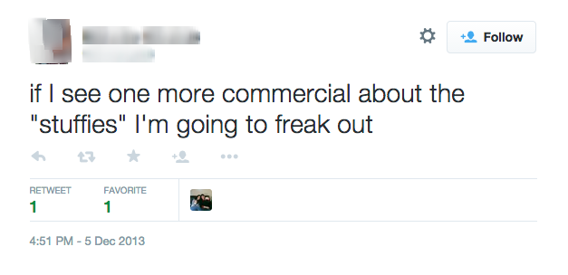
We’re almost at a loss for words, so we’re going to allow Twitter to react for us on this one:

4) East Hills Mall: Back to School
Before we comment on this absurdity of this commercial, it’s worth noting that this actually went viral. And if you can look past the terrible video quality, there is something positive to be said about East Hills’ willingness to highlight its employees. (People want to do business with other people, after all.)
However, if budget is an issue for your business (it is for most), there are plenty of cost-free ways to create content that is well … more professional. In fact, all you need is a smartphone to leverage social media platforms such as Instagram and Vine to create highly engaging visual content for your business. To help inspire your efforts, check out these tips from real brands that are getting creative with video on Vine.
5) Luvs: Poop, There It Is
“Alright. So I have this idea. We’re going to make a commercial about a cartoon baby pooping contest and put it to the sounds of an early 90s hip hop song.”
The fact that some variation of that conversation had to happen in order to make this commercial a reality is actually very disturbing.
And considering it was voted the “Absolute Worst Ad In America” in 2011 by Consumerist, it seems that the rest of the general public agrees.
Next time, stick to real babies … and focus less on the poop factor. There’s more appeal there.
6) Lamisil: It’s Alive
My eyessssss.
Rule #1: Never personify toe fungus.
Rule #2: Never personify toe fungus and allow it to lift up a toenail, expose the nail bed, and jump in.
In all seriousness, we get it. Not all products are “sexy.” However, there are plenty of businesses out there that are finding creative ways to make their “boring” industry something worth paying attention to. For tips on how to create more interesting content for your not-so-sexy product or service, check out this article.
7) Mentos: Bench
This one almost didn’t make the list – not because it isn’t painfully cheesy, but rather there were SO many painfully cheesy Mentos commercials out there that it was hard to narrow it down to this one specifically.
While I give Mentos points for creativity (I did not expect him to go all DIY pinstripe on us like that), the entire concept of popping a mint to solve your problems is a little bit of a stretch.
What commercials do you love to hate? Let us know in the comment section below.
from HubSpot Marketing Blog http://ift.tt/1ddsVuQ
from Tumblr http://ift.tt/1N3WbR9

No comments:
Post a Comment