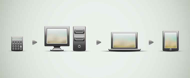
A lot can happen in eight years.
Think about what happened in 2007, for instance. That year, Apple launched the very first iPhone, J.K. Rowling published the final book in the Harry Potter series, and HBO's The Sopranos aired the controversial final episode.
Now, Apple’s about to release the iPhone 6S, filming has begun for the movie version of the Harry Potter’s spin-off book Fantastic Beasts and Where to Find Them, and Game of Thrones has displaced The Sopranos as the most popular HBO show of all time.
A lot has changed for businesses, too. For example, businesses’ websites are completely different than they were eight years ago. Websites created in 2007 look, feel, and function totally different than their 2015 counterparts.
Don’t believe me? Keep on reading. In the post below, I’ll go through four of the major web trends that have changed since 2007.
(And if you want to see how your website stacks up against 2015 standards, head on over to Website Grader for a free assessment.)
1) Design
Website design has evolved in leaps and bounds over the past eight years. Back in 2007, most websites were still using tables to structure their layouts and included flash and 3D animations. Less sophisticated websites were almost an assault on the senses, with a confusing mish-mash of images, links, and heavy text.
But design principles have evolved, and the best-in-class websites of 2015 are built with minimalism, flat design, and rich, playful interfaces, all in an attempt to give a better user experience. And it makes a difference – according to Kissmetrics, 40% of users won’t return to a site after a bad experience and 50% of sales are lost due to bad navigation and structure.
To see some of the design changes over these years, let's take a look at the airline, Ryanair. In 2007, their website was loud and cluttered, with a garish yellow background and overwhelming navigation.
That has all changed. Now, in 2015, their design has become the epitome of minimalism, with clean lines, easy navigation, and a simpler colour palette. The user experience is vastly improved, and has contributed to a recent 25% growth in quarterly profits.
2) Functionality
Originally, websites were simply an online calling card for businesses and shared little more than text-based information. However, over the years, website functionality has become increasingly sophisticated and catered to customers’ desires to buy and receive service online.
People are buying online more than they ever were before: Back in 2007, only 3.2% of all sales were online – and today, it's doubled to 7%. In addition, customers now expect that care issues can be handled online via self-service, click-to-chat, and even video support features.
All of these new functionality requirements place even greater demands on a website’s performance. Poor website performance will result in visitor abandonment, leading to a loss of conversion opportunities, sales, and consequently, revenue. So, it’s clear that optimising your site’s functionality to meet customers’ expectations can be essential to the success of your business.
To see these changes in action, let's take a look at Vodafone. Vodafone is one of the top mobile operators in the world, but back in 2007, ecommerce on their Irish website was very limited:
Fast-forward to today, and you can see their website has ecommerce at its core – you can actually use their site to directly purchase phones and service plans. Vodafone has also ensured their website performance has kept pace, resulting in a website grade of 92/100.
3) Mobile Responsive
Before the iPhone came out, optimising your website for mobile was a very low priority.
But today, about 50% of the adult population owns a smartphone, and they’re using it to actively find solutions to their problems. According to comScore, approximately 29% of total search queries are conducted via mobile. Plus, a recent Google study demonstrated that 75% of mobile searches trigger a follow-up action such as a phone call, store visit, or purchase.
So if you want to be tailoring your marketing for today’s consumer, you need to ensure your website is fully functional regardless of device type.
CNN is a prime example of an organisation that is leading the mobile friendly charge. They have a truly responsive website, which means that it adapts to the browser size and device type the viewer is using.
Desktop
Mobile
4) Personalisation
Traditionally, companies have provided the same online experience regardless of the person who’s viewing it.
However, in recent years, we have seen the emergence of a new trend: website personalisation. This means a website will adapt the content presented on screen in accordance with the audience, their device type, any previous interactions, and even their locations.
Research also demonstrates that personalisation works. HubSpot examined 93,000 calls-to-action over a 12-month period and found that CTAs targeted to the user had a 42% higher view-to-submission rate than calls-to-action that were the same for all visitors. Furthermore, a Monetate survey demonstrated that personalised web experiences deliver a 19% uplift in sales versus non-personalised sites.
Netflix is a classic example of personalisation executed brilliantly. The company, which offers the ability to instantly stream movies and TV shows, has seen a phenomenal resurgence in recent years. Their personalised experience ensures that users receive recommendations based on their previous viewing patterns, which stimulates increased usage and loyalty. However, back in 2007 this service was only in its infancy – personalisation wasn’t even a feature yet!
As of 2015, Netflix has 62 million users in 50 countries worldwide, and continues to grow at a speedy rate. Personalisation is a core part of the Netflix service offering and has been a key contributor to their success.
How has your website changed over the years? Let us know in the comments below.
from HubSpot Marketing Blog http://bit.ly/1TTqTEf
from Tumblr http://bit.ly/1HW23Hz

No comments:
Post a Comment