Buyers can be a fickle lot, can’t they? Small and seemingly insignificant things can either encourage or discourage a purchase. And these things change all the time! What once told shoppers to buy, buy, buy may now send them running in the opposite direction.
Fortunately, these things are tested again and again to make sure marketers know what’s working and what needs to change. Right now, these design trends encourage buyers to click through to the checkout.
White/Negative Space
Once upon a time, busy was better. Now, however, consumers want to focus only on the items they’re considering for purchase. That means products set against a white background will pop right into view, while those featured in sets and scenes will be overlooked every time.
The beauty of negative space is that it forces the eye to focus on the featured images. Colors, details, sizes, and accessories stand out and become important in the buyer’s mind. White space around those product images also means the descriptions and, more importantly, the CTA button will stand out. A CTA that stands out just begs buyers to click, like this example from Nike.
While some negative space will be easy enough to create, the product photography can pose some problems. Fortunately, there are several tutorials available to help you feature your products without distracting backgrounds or sets.
Large Images
With the growing popularity of mobile shopping, large detailed images are a must. If buyers can’t see what they’re buying, they’re more likely to pass. When they pass on your products, that doesn’t mean they’re giving up for good, either. It means they’ll go to your competitors.
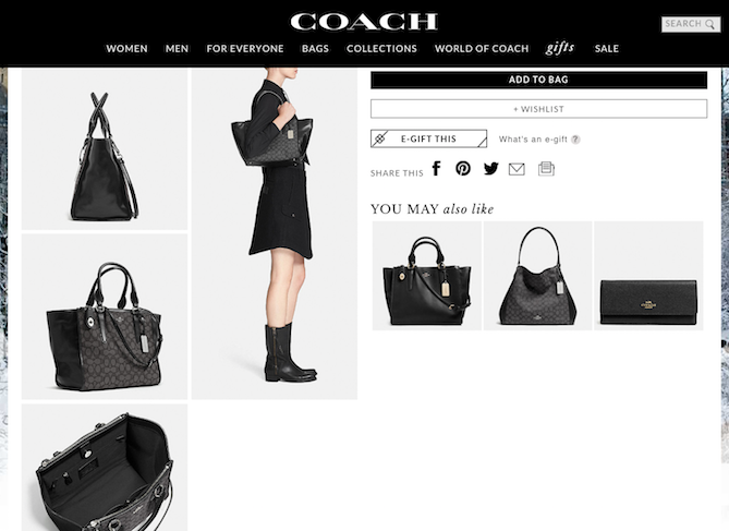
Your images should be large and clear enough for buyers to see every detail. A zoom feature to help with the smallest of details is always a great idea, too. Photograph and feature every product from a variety of angles, too. Buyers will want to see top, bottom, sides, and inner workings of everything you sell. Again, without those details, consumers will walk away and find a site that can provide the images they need. Coach does a good job of this, showing their products from almost every angle.

Remember, too, that images of the products aren’t the only images your buyers will want to see clearly. Any logos, text, and graphics shared on your site should be easy to view on absolutely any device. If buyers can’t see the logo, they may lose trust in your website.
What images capture your attention on ecommerce sites? Are there image types that you’re more likely to click on?
from HubSpot Marketing Blog http://bit.ly/1RQSbIY
from Tumblr http://bit.ly/1Q3xTee

No comments:
Post a Comment